
Design & Progress
Animation Year 2, 2nd Project
Group: Goda Jonaviciute, Logan Swift, Connor Smith, Samuel Capp
Vertical Slice
Tasks and Criteria
Evidence Asked
Evidence Provided
Task 1: Research – LO1, LO2, LO3
You should begin by researching games in
your genre.
You should research and analyse the type
of audience that you will be creating your
game for.
Analyse games for that audience from both a visual and contextual point of view, what are their characteristics?
Genre research
Audience analysis
Visual research
Find inspiration from an artist or designer and analyse their work for effectiveness.
You should aim for a mixture of primary & secondary research.
Research must be Harvard Referenced.
Harvard referenced bibliography
Task 2: Planning & Design – LO4, LO6
Your design stage will be shared between team members but should still follow the basic structure you usually do.
Narrative structure
You should develop the narrative structure via treatment sheets, character analysis etc.
Storyboarding
You should create a storyboard for any animation you may create.
Annotated rough designs x 20 - 30
You should create some preliminary sketches. These sketches must be annotated.
Developed Stage – Developed designs with screenshots and development rationales.
You should develop several of the best ideas into developed designs. You must have accompanying notes as to why you have chosen these designs.
Finally you should create your final piece/s.
Final design/s. (Story, Models, Concept art, GUI, Splash screens, Title cards, Credits, Controller layouts, Textures, Animations, Environment, Vehicles, Weapons, Effects, Maps, UI designs etc.)
Task 3: Evaluation – LO5, LO8
You must critically reflect and evaluate the research and design process. This may be submitted written, typed or as an oral video blog.
Complete Evaluation
Roles & Planning
Our next step after doing all of our research was deciding what we will be doing for our final piece, and deciding who is in charge of certain aspects.
Roles:
GJ: Buildings & Food
LS: Character Design
CS: Scenery & Animating
SC: Clutter & Misc.
Settling on this early on in the project meant all of our work was done efficiently and that we all had a chance to understand what leadership in a project would feel like.
Planning:
General ideas were thrown around on what we should make for the final piece/s, but one idea stuck with us the most. We wanted to create a trailer for our game to showcase the potential it could have. For us, this was the best idea as we could incorporate characters, scenery, items, gameplay, and story all in one short video.
Narrative Structure
General Info / Story Plan:
Before, people used to eat creatures as normal, but then the faction was taken over by the final boss who changed the rules of eating creatures by brainwashing the people into believing its evil because he is afraid of being eaten himself, in the end he harvests all of earths energy which corrupts it. The teams then eat his body (they can survive of his meat forever because it has all the nutrients from earth), the faction has the same goal as the wizard which is why they are after the group.
Because eating creatures is now forbidden, the faction has resorted to harvesting earths energy instead however this is inorganic which drains the energy from it and would start decaying. They are against killing but are also killing nature which defeats their whole purpose.
Throughout your journey there will be surprise cookoffs and if you lose it will respawn you and if you win you acquire an item to fight the final boss.
Exclusive items come from dungeons that you may need in a cookoff. When dungeon is defeated, you earn coins, higher levels of items which could be meat or armour etc… and also experience. You can get different abilities from your class skill tree which you buy with the experience you earn by killing and cooking different creatures.
After planning a general direction to go into, we all worked on writing a storyline for the first quarter of the game.
Tutorial / Prologue
You wake up in the great birth with your stomach rumbling very hard. An otherworldly humanoid figure tenderly lifts you up from the solemn pool you must have been slumbering in. Under a haze of fatigue and confusion you mutter to yourself about how hungry you are. The humanoid glowing spirit introduces themself to you as the overseer of the Great Birth. It explains to you that you have been born and must set out on a journey across this land. The tutorial then plays out where you kill a slime and fish in a and created slimed fish. With your hunger satiated the spirit tell you that they will oversee your journey from afar and you leave the cave.
Arc 1: Lasanija
The spirit points to where to go and sets a beam of light and says that fate is telling me to send you here. You pick up a sharp stick and make your way to the bridge. A large fish creature jumps out the water and begins to attack you after a cut scene. This boss fight is very hard but once you beat the fish creature you make a campfire and start to cook it. The people from the village come charging at you and kidnap you. Waking up being hanged from chains in a prison cell you are being flogged and shouted at. You begin to shut down and cry your eyes out and throw a tantrum. Everyone looks extremely confused until they shout that you killed the villages favourite monster and ate it. They say how he never attacked them and was a pure soul so eating him is unforgivable. You cry your eyes out and say that you don't even know what's happening and why I'm in this place I only woke up from some weird cave a few hours ago. The village residents, taken aback, start to cry and curse themselves for hurting an infant. They explain that in this world eating monsters is forbidden and dangerous and what he did was extremely wrong. The townsfolk free you and give you food and clothing and tell you to be safe and hang around the village for as long as you wish.
Arc 2: Sleepers' Sanctuary (Kelpie Boss)
After you leave the village, you head out to explore. Whilst walking around and collecting various plants, you hear a low hum coming from an area near the village. All other routes begin to be blocked off. You head towards the tree filled area. When you get near the entrance, the place is covered in a thick fog, you stop a little to think to yourself if its worth going in. With nothing to lose, you step into the fog.
The area is swamp like, with green moss surrounding the area which has bioluminescence, letting out a soft blue light when touched. Beams of sunlight go through the leaves to create a serene meditative atmosphere.
You take slow steps, and suddenly you see a figure in the distance. It looks like a unicorn. You feel vibrations in the ground, the sound of slow trotting and strange noises. Enamoured by the sight, you begin to run towards it, a smell starts to surround you. It is reminiscent of your first meal. Fish.
Battle:
The Kelpie does not fight back. Instead, it runs extremely fast. When it gets to 40% HP it then starts to attack you as a final attempt at self-defence.
FIRST STAGE:
Kelpie has the ability to transform the floor underneath your feet into water, dragging you down.
SECOND STAGE:
Kelpie has the ability to charge at you and attempts to bite.
After defeating the Kelpie, you are extremely exhausted and breathing heavily, hunched over. As you’re trying to focus on recovering, you feel a presence in front of you, the air begins to vibrate. Another Kelpie appears in the fog. It speaks to you; it explains to you that Everybody is taken or ends up dying in this area. The legendary Kelpie mummifies the bodies, but this process disrupts the souls from getting to heaven, which causes it to infuse into the earth. This then sprouts the soul as a forest spirit. People have heard rumours about this, but no one truly believes it because they worship the kelpie. The Kelpie can only be found by people on the brink of death. Its final words are “We will meet again.”
Confused and shaken up, you head for the exit. As soon as you leave the fog and are finally back in the open fields, you think everything is okay now. You look up from your feet, and you spot a middle-aged man with his legs crossed, floating, and meditating. You think you have lost your mind. The wizard opens his eyes and floats down, rolls down the hill towards you, suddenly gets back up and does a crazy front flip in the air. The air is vibrating in the same way that you met the Kelpie, which causes you to panic. The wizard then comforts you, saying it is fine, and he should relax. You have a brief conversation. The wizard says that it is very courageous for him to kill the kelpie, he believes you are some kind of prophet, but you are just confused and lost. He then gives you a recipe book, he does not want to kill monsters, so you are willing to take the job on for him. You’ve killed 2 already, why not carry on? He explains to you that this book once belonged to the ancient explorer, and he is on the search to find out any information about him that he can or even try to find him. To understand how the recipes are and to cook them properly, the wizard gives you a magical pot and a tutorial on how to cook properly. You make use of the kelpie’s ingredients to cook Kelpie Sushi. You start to eat the meal you just cooked, when you look up the wizard has disappeared.
Arc 3: Yeastard
Another beam of light appears, it is leading you to a larger village. This time, the houses are smaller, and the trees are growing strange yellow fruits. You are greeted by a forest spirit; however, you do not seem to understand them. It gives you a gift. The same fruits you saw are now in your hand. The spirit signals to the bottom of the fruit, it’s like it is telling you to pull it off. Once you do, yeast is scattered all over your hands. It claps and floats away, welcoming you to enter the village.
You walk around the village and find a mysterious shadow man, sitting by some crates looking depressed. You talk to him and find out he is in love with one of the forest spirits but cannot communicate with them. After a bit of confusion, he says he believes it is his dead wife, and that he must acquire a spirit shot to understand her. They both head out for the dungeon; the shadow man introduces himself as Seselis.
After a short walk and look around, you spot a dungeon in the distance. When you get to the entrance, Seselis is happy he gets to finally have a way to communicate with his wife. The exploration of the dungeon is simple, with a few lines of dialogue between areas. In the middle of the dungeon is a room with many spirits, which you both harvest and turn into spirit shots. This whole area is a tutorial as to how to explore dungeons and the loot you can acquire from there. After leaving the dungeon a screen pops up that tells you “Dungeons will now spawn around the map!” they are like sink holes in the ground and can appear randomly in clear areas.
Once you get back to the village, you sit with Seselis and take the Spirit Shots. After adjusting to your vision, you begin to hear high pitched voices all around you. You have unlocked Forest Spirit Speech. Frantic and excited, Seselis goes to meet his wife. They both cry, he turns around to thank you. It is an emotional scene.
Storyboarding
1st Idea:

Before modelling and getting on with our design work, we needed to figure out the general idea and order of our trailer. It was a rough and simple sketch, but it got the job done so that everyone agreed on the vision.
The beginning sequence is of a cooking pot in the ruins with the bubbles coming together to form our studio's name, Quest Book, which then fades to black. It is meant to set the scene of the main premise of our game being cooking and exploration, with a cosy feeling. A few scenery shots would follow after that, showcasing the nature and buildings of the island, giving a sneak peak to the viewers of what the game might look like and what there is to do.
We also planned on adding some characters. Showing small plot points of the story can intrigue the viewers and peak their interest, wanting to know more. A small sequence showcasing the foods that can be made in the game would appear near the end.
Solid Plan:

After making some proper concepts and talking more in depth of what we wanted our trailer to look like, we used the big whiteboard to create our final storyboard idea. This made sure everyone knew what they had to work on over the next few weeks, making sure nobody is confused or constantly asking what they are meant to be doing. We think this was a good idea, it prevented any confusion or arguments between each other, or people doing whatever they wanted.
For this version, we looked at some video game trailers to get a feel of what a professional trailer would include, we found out they usually contain the following:
- A screen showing the studio's/publisher's name
- Showcasing the scenery and mechanics
- Characters, and what their personalities are like
- In-game items
- The game's logo at the end, showing what platforms it will be available on, sometimes a release date.
Following this, we managed to add more scenes and ideas into it, to try make the trailer more realistic and similar to the ones real studio's release.
After the first scene, we added another scene where a dungeon opens its doors to the outside scenery. This was a better idea to our previous one of it just jumping into the scenery straight after the logo. It builds up suspense, whilst also showing off the idea of exploring dungeons in the game. A few more scenes were added in after that, including more building showcasing instead of it just being nature, and more mechanics being shown other than just cooking. At the end, we added in the game's logo to make it identical to most trailers that would be released.
Final Order Plan:

After a while, we managed to come up with more specific scenes to make it as good as possible. This required us to rearrange some scenes and make sure they all match up in a good order, a balance between calm and dark scenes. Although this is just a plan, it is probably what we will settle with in the end.
Concept Art & Sketches
SC:
_jfif.jpg)
_jfif.jpg)
_jfif.jpg)
_jfif.jpg)
_jfif.jpg)
Focused on creating concepts for weapons and clutter.
CS:

_jfif.jpg)
_jfif.jpg)
_jfif.jpg)
Mixed concepts for plants, environments, and weapon.
GJ:
_jfif.jpg)
_jfif.jpg)
_jfif.jpg)
_jfif.jpg)
_jfif.jpg)
_jfif.jpg)
_jfif.jpg)
_jfif.jpg)
Main focus on building concepts.
LS:
_jfif.jpg)
_jfif.jpg)
_jfif.jpg)
_jfif.jpg)
_jfif.jpg)
_jfif.jpg)
_jfif.jpg)
_jfif.jpg)
_jfif.jpg)
_jfif.jpg)
_jfif.jpg)
_jfif.jpg)
_jfif.jpg)
_jfif.jpg)
_jfif.jpg)
_jfif.jpg)
Mainly focused on character concepts, some environment ideas.
Map
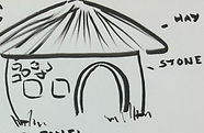
1st Map Idea:
_jfif.jpg)
This first map idea was made by Sam (clearly). It was a very basic and generic idea for a map to understand what we wanted to do. It may look silly, but it helped to create the final map design that we created.
To make this we just thought of the places that a generic RPG might include:
a village, forest, one large significant building like a castle, and some kind of a water source.
Inkarnate Design:

By using Inkarnate, we all sat down and planned out the island's shape including the biomes and town areas.
The idea for our map was to make it a cooking pot/cauldron, to further emphasise the cooking aspect and how important it is in the culture of the
people living on the island. Instead of basing the island off of the culture, we decided it would be much more interesting if the people of the island
saw this as some kind of calling to make their culture heavily influenced by
food and cooking.
The final map design was heavily influenced by this second rendition. Based
on this map we managed to come up with several names for each region
and town/village. This version was quite quick to make as the website has
all the tools needed to create a concept of a map without spending too
much time, also giving us less stress if something is misplaced.
Final Concept Design:
_jfif.jpg)
After finishing the design, Goda drew out the final concept for the map. It
included a lot more detail, whilst referencing real world and other video game layouts.
The whole group worked on the names for the areas together, the theme of
food and ingredients was kept throughout. Some of the names aren't in
English as according to the other people in the team Lithuanian sounded cool. We applied the idea of using a different language to make 2 specific
places that are important to the story names obvious to Lithuanian speakers,
yet would require some research from others. The names "Duona" and
"Batonas" mean black and white bread. This references the differences
between the corrupted area (black bread), and the biggest city (white bread), also showing the hierarchy of the leaders compared to the people
suffering from the corruption in Duona.
Final Map:

We are very happy with how this map turned out and it followed our vision
perfectly, however there were a few issues along the way. For the base of
the map, we used a large piece of paper and dyed it using tea bags.
Because of the size of the paper, we all had to move the teabags quite fast,
which caused some of them to rip and spread tea leaves over the paper.
It took a couple of days to dry, then we wanted to further the look of the
map being aged, so we decided to burn the edges. This was probably the
biggest issue we ran into the whole entire project. Instead of ripping up the
edges to make sure the burning process would go smoother, we went
straight into it with a lighter outside. At first, it was going very slowly, the
the wind was blowing in many different directions which made it hard to
burn. However, when we did manage to get it burning, a bit of a disaster
happened... We rolled the map up into a cylinder so the burning process
would go smoother, but this also managed to catch on fire. We tried to
whack it onto the ground and it stopped. Momentarily. As soon as Logan
picked it back up it lit of fire again. It was confusing because the floor was wet. When we were about to go back in the security guard came over and we got told off so we probably should not do something like this near college again, and if we do, we have to be a LOT more careful.
Even though we had some hard moments, it ended up looking good and authentic. One side is visibly much darker, but it makes it look as if it were damaged by natural causes. Perfection doesn't always look the best.
After this was done, Goda inked the whole map using black and gold ink. This took a few weeks of on and off work, but was worth it in the end.


Inking the map.
Burning the edges.
Regions
The Great Birth:
The beginning of all life, starts here. All that lives in the land of Cuisinia is born here. The residents don't really question it, everybody just agrees with it.
Sleeper's Sanctuary:
The place that all life finishes.
Crumble Craters:
Crumble Craters is based off of deserts and sandy areas, whilst also being a mountainous region too. It has no residents or buildings, and it covered in huge amounts of sand.
The sand in this area is used as an ingredient in many recipes, mainly those that are starchy, like bread and cookies. Not much is known about it.
Lasanija:
Lasanija is the smallest of the 2 villages in Cuisinia. Located near 2 sources of water, its main source of money is from selling fish and farm goods to Batonas and other residential areas on the island. It is known for its high quality fish and seafood, as well as the pasta plant, Conchigle.
Although it doesn't have many residents, it is a lively place constantly crowded with merchants and forest spirits helping out.
Yeastard:
The largest of the 2 villages in Cuisinia. However, it is not inhabited by humans! This village is bustling with small creatures known as the forest spirits, it is their home. The Yeastfruit is grown only here, yet used nationwide. All residents of the island are incredibly respectful of the forest spirits, even working alongside them to make sure all work is done efficiently. For some reason, they can communicate, even though their noises cannot be understood by the average person...
Genoise:
A town located in a small corner of Cuisinia, known for its sweet treats and pastries. Any person with a sweet tooth would adore this town, yet it is extremely close to being corrupted. The residents seem happy, yet they know the end of their region is approaching.
Batonas:
The city of Cuisinia. A busy city with a marketplace at the centre of it all. This area has everything you could possibly need, from food to weapons. The leaders of the nation reside here, taking care of everything.
Duona:
A region corrupted by the faction. It used to be full of greenery and unique plants, yet is now gone forever.
Fungal Forest:
A large forest taking up 1/6th of Cuisinia's land. Many special plants and berries grow here, maybe you will even find a special creature selling unique resources...
Crystal Waters:
Borders several types of biomes, nobody knows how this is possible, but it's where many people source their clean water from.
Flowing Wine:
An extremely special lake. The fish is here seem to act quite strange, be careful if you try to swim here.
Food, Consumables & Misc.
One of the scenes in our trailer is a sequence of some of the foods you can create in the game. This meant we had to both plan out different recipes, model them, and texture them properly.

Plan:
To plan out some recipes, Goda and Logan used the whiteboard to sketch out some ideas. We tried to use both fantasy elements and create foods that relate to the research that was done. Most foods from that era consisted of basic ingredients that were quite bland, like fish and bread.
Creating unique dishes was difficult yet fun. It was nice to experiment with different shapes, as well as ideas of how the textures and tastes would translate to real life. For example, our plan was to have the first dish as something edible but disgusting. We came up with slimed fish, which is able to introduce the player to 2 necessary mechanics: fishing and combat. This also helps with character development in the story as the main character has to learn to adapt and cook meals with unusual ingredients.
The rest of the meals take inspiration from real life:
- Yeti Tears Snow Cone = Snow cones
- Cauldron Stew = Soup
- Unicorn Kebab = Kebabs
- Pheonix Burger = Chicken burgers
- Minotaur Steak with Skeleton Bone Marrow = Steak
- Evil Spirit Shots = Alcoholic drinks
- Pearl Balls = Clams
GJ:
Phoenix Burger:
The first food that I modelled was the Phoenix Burger. The idea was relatively simple, but it also needed to have it's own charm to it.
For the meat, I subdivided a cylinder and then sculpted it to try and replicate the texture of what a meat patty would look like. Replicating this was easy, but I also needed to keep in mind that it can't be too realistic to match the art style that we are going for. I ran into issues with the topology for the top of the patties, but I didn't pay much attention to this as it was for a trailer and wouldn't be seen anyways. If it were for a game, I would try to optimise it, but since we were on a time limit I left it as it is.
However, we ended up with something else due to some miscommunication. Logan's idea for the burger was to have the meat as chicken instead of the usual beef, so I had to remake it. This was simple to do with just a displacement modifier to replicate the way a chicken burger patty would look like. I agree that it does look better, and this was a good thing to learn that we had to communicate our ideas to each other more often so that we're on the same page.
_edited.jpg)
_edited.jpg)

After all of this, I had to add cheese to finish off the filling of the burger. Using a cloth modifier made this extremely easy and also gave a natural look of melting cheese, it meant I didn't have to move individual vertices to achieve this.
As a group we had settled on a few shader nodes on Blender to use throughout our modelling so that it was the same style and fit when our work was put all put together. For the burger, I used our cel shader to show the grooves and dips in each part of the burger for more depth and colour. Even though it is simple, I really like how it turned out. For the fire, I experimented with effects. Since it did not count as particles, it was easier and rendered faster. For the fire, I used more vibrant pinks and purples instead of reds and oranges for a unique look.

Final Render
Fish Soup Bread Bowl:
I then modelled the fish bread bowl. This was fairly simple and I managed to experiment with sculpting a little bit more. I tried to add details to the fins, but at the same time trying to make it look more like bread.
There were 2 things I struggled with on this. The first thing was creating the hole in the bread bowl where the soup is meant to go. At first I tried to select faces and move them down but this made the edges too jagged and it didn't replicate how bread would work. Instead, I sculpted it down. This doesn't look as good as I was imagining, but it looked much better than before. The only issue being that the edges are too thin.

After that, I added in the soup and rosemary. I struggled quite a bit with the bits in the soup, although it was simple, for some reason it would disappear any time that I clicked 'Play Animation'. It turns out the issue was with the plane on top of the soup, as it was copied from my fire shader and any movement would autokey. After around 20 minutes I managed to figure it out properly and texture it.
The textures are simple, whilst also trying to replicate the real-life textures of the fish, potato and carrots.

Final Render
[NOT USED] Jam Jar
Although this model was not used, I thought it would still be important to include it in our design writing work as I experimented with a lot of nodes to achieve the glass look.
Although it looks complicated, I think after a while of doing shader nodes on Blender I am starting to understand what each one does. I followed tutorials for most of the shaders but then adapted them to suit my liking and to fit in with the other textures that people are doing.
I think this turned out really well, so it is quite sad that we weren't able to use it. This is due to me not organising my files properly, so I was not able to include it into the food sequence scene.
If I were to finish it, I would have designed a label to fit the story and experimented with the texture for the cork.


LS:

Unicorn Kebab
I was stunted as to how I was going to approach creating such a form with the unicorn horn so I looked on Youtube and I found a tutorial from this dodgy my little pony fan which was very difficult to understand but I eventually figured it out. I don’t think there is any special to note with this model as it was quick to make and the forms aren't very complex apart from the horn the met chunks are just subdivided cubes with the polys moved around.

Berry Cake
I wanted to create a very whimsical and cute cake that Goda would enjoy because she likes cute things and baking. I followed her concept design as close as I could and used pastel colours and shader nodes to create that painterly effect. For the strawberry I played around with my normal cel shaded setup but added voronoi and it looked really good and added a lot of detail and made I look like the strawberry was glistening. Everything was mostly just primitivities and it went fairly smoothly with no hiccups.
Kelpie Sushi
I wanted to create the maki and nigiri but I only ended up creating the nigiri as there were time restraints and it was too hard. To create the rice I used the cloud setting on displacement and changed it around a bit to make it look like a clump of rice. The kelpie sashimi was just a cube with extrusions and subdivision. If I could do this again and if I had more time I would bake a map of the fish texture and make it look a lot better than the final result.

Yeti Tears Snow Cone
The model for this wasn’t very hard but when it came to texturing I was struggling to use Substance Painter. I had no clue what I was doing and I was really struggling so I ended up using shader nodes and it looked better than anything I could’ve made in Substance Painter. It is probably my favourite texture that I created because it is exactly how I envisioned. I want to explore Substance Painter in my next project as it is something I need to learn.

Crumble Craters Cookies
I don’t have much to detail in the creation of this as it was very easy and took me around 10 minutes to create. I think these turned out aesthetically pleasing to the eye with the texture that neatly wraps around the circular form of the cookies with the mild but tasteful distortion the beautiful colour colour scheme brings life to the predisposed base model in an awesome way.

Pearl Clam
This model was easy to create but I wanted to go all out with the textures and make something absolutely stunning and breath taking. The final form that this model bloomed into is truly tantalising and serves as visually stunning eye candy for one. The staggering use of colours liberated the form waiting cocoon of this base model and it it breathed life into the desolate wasteland of the grey texture into a-new.
SC:
Weapons & Clutter


In the designing phase I was in charge of weaponry. I begun by making a Crossbow, I used a template to help with the basic design of the crossbow; the hardest part was creating the bow as I struggled to get the bow to bend perfectly so that it crossed over the string eventually, I was able to create a bow that I was happy with. I then decided to create a cannon; originally, I tried to use a template for the cannon however the final design look to blocky and didn’t look like it belonged in that time period so I decided to try and create my own design. When I was researching about Medieval weaponry they used cannons however they were push around on wooden supports which also helped keep the cannon in place, I knew I wanted to try and replicate this design. Overall, I was happy with how my cannon turned out but if I was to go back and change something I would change how the actual cannon piece looks as its not round enough.
I was also in charge of miscellaneous items such as chests and torches. The first item I made was a torch attached to a wall; creating the torch was easy apart from creating the little dish as I had to create each gap and connect the sides separately. The hard part however, came when I decided to add a particle system onto the torch to create a fire; I had never properly used particle systems before and found them very confusing because there is so much many things you need to know, the torch turned out alright and I even added a light which glows from red to yellow as the fire burns. The next item I created was a chest, with the chest I knew I wanted to create the metal stapes that go around the chest similar to how medieval chests looked and I believe I have captured that deign perfectly; overall, the chest was surprisingly easy to make apart from having to tweak a few minor things I didn’t run into many problems. The final Miscellaneous items I created were boxes and barrels; with the boxes I wanted to try make them look like crates as these were typically used during the medieval period and overall, I am happy with how the boxes/crates look which were thankfully easy to make just a bit fiddly when trying to get the crosses into the correct place. The Barrels where a lot easy and less fiddlier to create meaning I created them a lot quicker than the boxes also not running into any problems with the final design looking good.
Throughout creating these items I was constantly looking back on the concept art pictures I had drew up before I had begun creating. This helped me
me a lot as it meant I constantly had a reference image based upon my own ideas. This piece I am most happy with is the crossbow as I really like how
the overall design of it looks especially considering how fiddly making the bow part was. If I could go back and change one thing it would be
Changing how the actual cannon looks as the back of the cannon looks really weird and I don’t like how it turned out.
Texturing


I started texturing in a software called Adobe substance painter which I had used before in the past so I understood the basics of it. You begin by selecting what item you want to texture then export it into substance painter, once that’s done you want to name each part of the item so then it's easier to apply them when imported back into 3dsmax (This is something I forgot to do on my first attempt which made it tricky when applying the textures), I then begun deciding what textures I wanted on each item and was adding a 'dust' modifier which makes the items look like they are all connected. Importing and applying the textures isn't very hard however, it does take time to do it and can become quite fiddly or messy. I kept repeating this process for majority of my items and was beginning to enjoy doing the texturing as it was fun and easy until, I was reminded that the theme for our game was a painterly theme and not a realistic theme like I thought it was; meaning that every item I had already textured needed to be retextured which would take a lot of time however it had to be done. The boxes didn’t need to be retextured as they already had a painterly texture on them.
To begin with I struggled with creating the painterly theme as I couldn’t get a style I liked; I even tried using tutorials however, they ever didn’t work for me or required me to download something which when I tried to didn’t work. Thankfully, Connor helped me and told me about generators which gave the items have a somewhat painterly texture that also looked quite good only problem though was that there was a lot you had to get one generator looking like how you want it to but once ones done you can copy and paste it onto others and just change the colours. I enjoyed making the painterly textures just not as much as making the realistic ones (even though they were wrong) this is because it took longer and was fiddlier.
When it came to texturing in blender Logan already made a painterly material so all I had to do was copy the setup and just change the colours. Some of the textures that appeared on my scene had already been made on substance painter; so for these assets I had to acquire the materials from my teammates and then apply them on blender however, you must use a different setup then the one you use for the textures on blender thankfully, making the setup wasn’t tricky.
Overall, I enjoyed the texturing process despite my little mistake. My favourite textured item I made would probably be the grass that appears in my scene as I really like how the colours match the trees and when there is lightning in my scene it makes the texture look exactly like a painterly texture. If I could go back and change something I did it would be forgetting that the theme of the game was painterly and not realistic as this took up a lot of my time.
Misc. Items


Once my scene was finished, I was tasked to continue making more random items. I began by making a potion bottle for Connors black market; once again I was using blender however, I felt more comfortable using it now; I ended up using a tutorial for the bottle as I was struggling to create the shape I wanted. Once I had created the bottle, I sent it over to Connor who then textured it and overall, the potions turned out well. I was then tasked with making mushrooms that would go into the black market to act as magic mushrooms; for the mushrooms I wanted to create my own design and not use a tutorial. Using my own design worked out very well despite the number of times I tried to create a mushroom I was satisfied with and I’m very impressed with how it turned out; similarly, to the potion I sent the mushroom over to Connor who then textured it. I enjoyed making both these items as they were quick and easy to make but also wasn’t overly complicated.
I was finally allowed back on 3dsmax where I created a few more miscellaneous items for the scenes with the first one being an Anvil. Similarly, to the crossbow before I ended up using a template to create the general shape of the anvil; once the shape was there, I begun upscaling it also adding details such as the handles on either side and because I because using blender anymore I had to texture it again in Adobe Substance Painter. Overall, I am very happy with how the anvil turned out even though it isn’t very basic; using the template helped me so much as without it I would’ve struggled creating the general shape. The next item I made was a medieval looking lamp post that would go in the background, I wanted to add some small details onto the lamppost to make it look more realistic and not so basic. I enjoyed making the lamppost as I was applying a lot of my 3dsmax knowledge into making it and I really like how it turned out especially with the added detail however, I don’t like how the base looks as its too big and looks weird.
Logan then wanted me to create a staff for his wizard. The wizard has a sun on his hat, so I already knew I wanted to make the crystals on the staff a yellow colour to match the sun. Making the shape of the staff wasn’t too tricky apart from the bend at the top as I couldn’t get it to bend perfectly similarly to the bow eventually, though I got the bend perfectly and was very impressed with how it turned out; I also wanted to make the staff look natural like it had just come from a tree so I added some small branches coming off the staff with little leaves on them. The staff looked very basic, so I went into blender and begun sculpting, I sculpted it so there's something swirling around the staff to make it look more like a tree and it turned out quite well and looked less basic. I then went back into 3dsmax and decided to add handle wrapped around the bottom of the staff for the wizard to hold onto; with the crystals I created one shape and then copied it then downscaled it to fit around the main crystal.
Character & Mob Design
LS:
Experimenting

This project I wanted to practice sculpting and get to at least a basic
understanding of how to go about creating characters. I decided to
sculpt a bust of batman because he is a character commonly
sculpted by people and there are years of references to use. I also
find it easier to sculpt male characters because predominant facial
feature such as cheek bones and deep eye sockets are blockier. I
decided to use blender to create to sculpt because the college
didn’t have access to a z-brush licence during the time I was starting.
Blender also has a much more simplified interface so I can
understand what I’m doing better as a beginner. The sculpt went
quite well apart from the topology kept getting folded into itself
because I didn’t know what I was doing. Initially I wanted to create
something more on the realistic side but then I decided to go for a
more stylised route because I didn’t think we would be making a
realistic game because of our lack of skill. Everything went decently smooth, and I enjoyed my time creating this sculpt. Looking back, I think I should’ve gone for the more realistic approach because I put a ton of effort into the initial realistic sculpt then just got rid of it all which was a bad decision but this is a throwaway sculpt so I don’t really mind. I learnt a lot of basics from this which I then have used in future human character sculpts especially for the face.
The general art style was heavily inspired by arcane so I wanted to fuse an anime art style with arcane style texturing. My plan was to create anime style hair with arcane like facial featuers and texturing.
Main Antagonist
I wanted to create a scary and uncanny looking main antagonist for the game which is also elegant looking and handsome. I knew I wanted to make him a human with the features of some sort of animal and mix them very uncannily whilst keeping him with strong features to make him look handsome. I wanted the character to be a foil to the wizard so I needed night motifs in his design to oppose the sun on his hat without slapping a moon on his forehead. I started to research nocturnal animals and eventually landed on a bat because they are probably the most well recognised nocturnal animal. I also picked a bat to oppose the lion motifs in the wizard’s design because a bat is small and weak but illusive; a lion is bold, strong, and proud. If he was a bat human hybrid, that is obviously just a vampire, so I started to look at vampires from old movies as reference. I used Nosferatu from the original 1922 movie because 100 years later he still looks horrifying. I began designing and I came up with a general design quite quickly.
This was the final design I came up with and I think I perfectly encapsulated my idea into fruition. The only thing I tweaked was adding a flower to the side of one of his ears but It looked better without it. I referenced pallid bats and gave him the ears and neck fluff like one. The nose was inspired by vampire bats because I think they look the most uncanny and menacing without looking silly. I gave him no eye brows and clear eyes to make him look uncanny, but I gave him a strong facial structure and long hair to make him look handsome. I asked my friends what they thought of him and I got the perfect responses of the girls saying he's attractive and the boys saying he looks cool and scary. I was mainly influenced to create a beautiful looking main villain from many manga that I have read. The best example is Griffith from Berserk because he is one of the most hated characters in fiction for being so unredeemably evil but everyone in the story thinks he is a beautiful angel that is leading the world to a better future, when he is an sociopathic monster with no humanity left inside of him.
The sculpting process was quite easy for me to do as I used everything I had learnt with the other characters into this project I tried to keep it as low poly as I could without using retopology. The head and bust came out to around 91 thousand polys which I think is decent enough for what I wanted to do. I was scared to make the hand for this scene but it actually ended up being quite easy and I was quite impressed with how it turned out. I sculpted in detail to make the hands look skinny and bony to add to the uncanniness. I used the same technique for the hair like I did with the others but I didn't model everything because the poly count would have been extremely high again. I decided not to include the neck fluff because I didn't know how to make that fit in with the art style so the neck fluff is now a removable scarf. I also wish I spent more time creating a good colour palette because I think I made his skin colour not pale enough, When I made it pale it looked really strange and didn’t work well so I think what I came up with was the next best thing.
With the base model finished I opened the character in substance painter to realise that I could not texture at all and I needed a new plan. I played around with shader nodes and edited the cel shader setup I was using for some objects and added extra things to add detail and I really like how it turned out. Arcane was a huge influence and I think I got close to how arcane looks. The nose area is kind of messed up but I don't really care at this point I just needed this thing finished. I used the same texture on the hair but with minor changes to create the illusion of cel shading and minor line art.
I made the orb of the power of the earth and added a shatter modifier and then added other details such as emissions and texture. I think the final render turned out very well, not perfect however.
Wizard / Ancient Explorer

Final Design

Progress

Render
I actually created this character design a long time ago as I wanted to use him as one of the main characters in a web comic but I ended up scrapping it so I'm glad I can use this design finally because I think it looks quite cool. I would show what he initially looked like but all those old files corrupted but it generally looks the same apart from having an extra cloak and shorter hair. I wanted the character to portray a proud and strong appearance so I took influence from lions and used the same colour palette of a lion and made the facial hair really big and loud to portray a mane. The original concept had orange colours but I think the yellow is more visually pleasing. I also added armour underneath the giant cloak to show that he was once a warrior that has put his past behind him.
Modelling him was surprisingly smooth and I didn’t really have any hiccups to note. I knew exactly what I wanted him to look like so Everything went quite smoothly. The end poly count ended up being around 3 million polys which is quite obviously horrific but The retopology wasn’t working when I put him into z-brush but that is probably just my fault. I also didn’t know how to bake the face properly so I would have lost the detail. Next time I create a character with intense sculpting like this one I am going to be very careful and conscious of the poly count. I also need to learn retopology properly so I can have characters that are animatable.
I used shader nodes to give the wizard texture and I think it looks quite cool.

Wizard Head
Great Birth Overseer


This is probably my favourite design of this entire project and I think it ended up looking really cool. At first I was going to create a knight character to be fighting the minotaur, but I decided to use a character that we had already wrote in the story and used the great birth overseer. The original concept for the knight was going horribly and I didn’t want to make anymore armour so I ended up making something more different. I wanted to create a spirit-looking character with humanoid properties so I looked for folk art of spirits. I ended up looking at Chinese folk art because I saw some glimpses of it and it looked very beautiful. I wanted this character to directly oppose the wizards design so I used a blue because its yellow inverted. I wanted to incorporate a tiger like design to the character too as the wizard looks like a lion. In Chinese folk art the tiger is depicted as elegant and sometimes demonic looking so I wanted to have a look of mistrust in the character's design. I came up with the idea of adding a flower over its face so it has no facial expressions. I wanted its frame to look androgynous but strong. I wanted the character to have a bowl cut which was connected to poverty in the medieval times but give them beautiful kimono which would be expensive and reserved for the rich in feudal japan, this is to add to the mistrust element. At heart the character is very morally grey but had a good heart so I wanted to keep the design not evil looking just with a slightly uncanny edge. I wanted the deign to look cool styalised but if you saw this person in real life it would probably be quite a terrifying sight due to it having no face and its towering frame. I also wanted it to have a cloud shroud that is usually depicated on yokai and gods because this charcater was a spirit.
I sketched out a really rough concept in paint and then
got to work because I didn’t want to waste time creating a proper concept art as I would get side tracked and spend too much time on it.
For this design I used poly modelling instead of sculpting as this character was 100 percent going to be animated so I needed to keep the poly count as low as I could. I started making the body and I was actually really impressed with myself at how well it was going. I thought I was completely useless at creating bodies but it actually went very well and smoothly. At some part the topology was being strange but I ended up fixing it. I tried to keep everything as low poly as possible with sacrificing detail and it ended up at around 8k polys.
Minotaur


I wanted to add a boss in the trailer so I decided to create the minotaur. The reason I wanted to is because I tried to model a cow ages ago and it turned out horrible so I thought I should try do something similar again. I made a sketch of the minotaur design and started modelling. I started from a cube and extruded out parts and added topology where necessary. My goal was to try keep under 15k polys so I was very careful and I didn’t sculpt anything. The face was the hardest thing to make as I had to started from a single vertex and make the shape out of it which was on the more difficult side but I wasn’t overly struggling. Everything went quite smoothly and I was really enjoying myself creating this model. To texture it I used shader nodes. If I could do this again I would have added a basic rig to the eyes.
Seselis / Shadow Man


This design was also in the back of my mind as the wizard and this character were meant to be friends in the story I had planned.
I drew out quite a few concepts to get it right and settled on the simplest and friendliest looking one. I really enjoy the simplicity of the character design and the obnoxious shapes used which create a strong and memorable silhouette.
I didn’t model the sides because it would not be shown in the scene that I had created it for. I experimented with grease pencil on this design but it ended up looking really strange. I like how it looks and if I had to do something differently I would have modelled the sides.
GJ:
Forest Spirits

_edited.jpg)

For the forest spirit designs, I wanted to include flower motifs to them to show that they are from the forest.
The smaller flower creatures are called "Zibute" which is named after the flower Hepatica that grows in every forest in Lithuania. These are the more common spirits and have more variety in their petals. The ones I made are inspired by pansies and daisies. They have minimal floating abilities, and can progress with age.
"Plantasia" are the middle rarity. These are the green ones with flowers sprouting from their bodies, they have the ability to float around and fly faster than other spirit types.
"Lilenne" are the rarest type of forest spirit, inspired by Lily of the Valley. They tend to be very intelligent creatures and easier to understand by humans. They are also usually in charge of helping humans, leading the way for smaller forest spirits.
Forest Spirits come to life after a person dies in the Sleepers' Sanctuary. Due to the starting events in the story, the legendary Kelpie performs
mummification to the people who arrive to let their soul rest. This backfires, the soul cannot rest if it is mummified. This leads to their soul sprouting as a forest spirit, they can understand humans but their speech can only be understood if you take the measures needed to understand their language.
The modelling used some simple sculpting just to get the desired shape quickly, and the texturing was simple due to the shader nodes that we agreed as a team to use throughout our game. I would've liked to use less polys, but I was too far in to take that into consideration as we were not optimising for an actual game.
There were some issues with animating them, mainly the Plantasia. The flowers and eyes would move around strangely, but we ended up deciding that it looked quite cool, and it was a quirk they could have.
SC:
Creatures


I was tasked with creating some creatures for the game. Originally, I tried using Zbrush which is a software that I had never used before so found it very confusing and eventually gave up and moved back to blender which proved to be a lot easier. I began by trying to create a cyclops creature, I started off by creating the generic shape of the head and then started adding detail on his face giving him ears and a jawline which was going very well. I then started on the mouth which was a bit of a struggle and I couldn’t give the sculpting brushes to give me what I wanted exactly eventually, though I was able to get it somewhat near what I wanted and even gave him teeth making them different sizes which I was very happy with; unlike the mouth making the eye piece was very easy and adding the eye was the same. I then begun on the body however, I was struggling to create it as I couldn’t get the body to extend to add more space for detail; to fix this problem I sent it over to Logan who completely changed my idea of an evil looking cyclops into a fat friendly cyclops that works in the black market. Overall, I was annoyed that I couldn’t continue creating the cyclops as I was enjoying making it but I was very impressed with the work I put into it as sculpting isn't one of my stronger skills.
For my next creature I was sure what I wanted to make so I began by messing around with the brushes and eventually I created something I liked; I then started working on the mouth which was a lot easier to make compared to the cyclops mouth however, the teeth were tricky to make as I struggled to angle them perfectly. I then started texturing the dog-like creature and after messing around with many colours I settled on an orange and red mix texture that I really liked. I also sculpted a tongue that looked very good and settle with yellow for the colour; once again making the eyes was easy. Unfortunately making the body went awfully as I really struggled to create the arms and legs as the topology was really messed up; after hours on working to fix the topology I gave up on creating the creature as it turned out it wouldn’t appear in any scenes.
The final thing I created was a black cloaked creature that would appear in the snow scene, I started off by making the basic shape in 3dsmax then converting it into blender where I could begin sculpting. I wanted the cloak to look like it was being worn the creature and was really struggling until I discovered the crease brush which helped me sculpt the body; however, when it came to the hat I struggled as there weren't many polygons compared to the body so the crease brush doesn’t work as well. Texturing was simple as the creature was going to be all black but I decided to add some small hints of grey into it which looked good.
Overall, I was impressed with my creations as sculpting isn't something I'm good at and my skills could need some work. I was most impressed by the cyclops as it looks good and looks like an actual cyclops. If I could go back and fix something it would be the dog creature as the topology on the body was really messed up and unfix able which forced me into giving up which was annoying because I was liked how the head turned out.
LS:
When Sam showed me a sculpt he had made I thought that I should try my skills at improving it. I have said this before that I can really hone my skills if my task is too recreate or add to something already conceived. I fixed the topology and made the character look more visually appealing and cuter. I experimented with the cloth tool and gave him an apron which I think looks really good and adds to the food theme. The hardest part was the mouth area but I think it ended up looking quite good.
Cyclops / Steve Edit


Previous
Remaster
Main Character
I wanted to create a design that was generic but appealing in the art style that we had created. In other words, in a simpler art style this character would look very boring. I took large inspiration from Viktor from arcane with this sculpt and tried to replicate his facial features. He is my favourite character design in arcane so I wanted to make a design inspired by him if we were going to attempt to replicate the arcane art style or at least be inspired by it. I accidentally did something to the eyes to give it that inward affect and I have no idea how I did it but it brings the model together so well and makes it look so much more professional than it is. The hair was really fun to make and I just ended up doing my own thing and follow my original concept art similarly but going with my own thing. I sued reference photos of David Bowie and Andy Warhol as they have very striking facial features similar to what I wanted to portray with this character. The eye lashes where hard to initially create. I used a single vertex and moved it around the eye but the form was much more complicated than i gave it credit but I eventually figured out how.

Environment Design
GJ:
Ruins Area
I started by drawing out a general idea for what I wanted this area/scene to look like. I had to take into account the location of the ruins, the time, and what it is meant to show to the audience.
After talking to my teammates, we decided this would be the first scene and has to show our studio's name. After hearing this, I felt quite a bit of pressure as this would be the first scene in the trailer, so I really had to put as much effort as I possibly could.
For this area, I wanted to include the cooking pot that you acquire in the game, a relaxing atmosphere and show the main pot of the game being cooking.
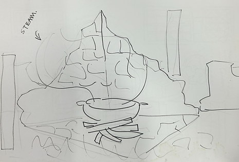
General Idea for Scene
I then started to model the scene. This looks complicated with all of the cracks and damage made in the bricks, but this was done easily by using the One Click Damage modified on Blender.
I really like the effect that this made, especially since it only took a few minutes to do. I moved around each block to replicate how real life ruins would look like, with them shuffled around, some dipped into the floor.
I enjoyed making this as I could experiment with using references to match how real ruins would look like, making it more immersive. In the future I would like to create more detailed buildings/ruins that reflect real life.

Ruins Base


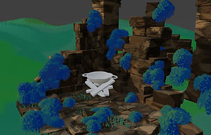
After getting the base of the ruins done, I modelled the cooking pot and planks. This was, again, fairly easy with the use of One Click Damage, making it to look more detailed. I tried to replicate the idea of old cooking pots that could be used over a campfire, with as much surface area as possible to make sure everything cooks evenly. This would make sure that the bubbling in the animation would make sense.
The moss was fun to make, I got to once again experiment with shader nodes in Blender and how the colours would interact with the light. I made an alpha to add onto the shape and used a particle system to create the "bushes".
I drew these by hand, trying to create a unique pattern to use. I believe this turned out well,
its stylised which exactly what we were aiming for, and isn't too jagged which replicated the
soft feeling of moss.
I changed the grass around a lot of times, since the scene is at night the grass can't be bright.
With the way we modelled our grass, it cannot use shadows without ruining the painterly
style. This meant I had to change the entire texture to be darker, which I painted in
Photoshop.
The texturing for the blocks was interesting to do, it was the first time I had done such
complicated shader nodes so it took a while. However, I am really proud of the result. The
texture reacts with the lighting that I had put in the scene, which gives it a cool effect. In the
future, I would like to continue experimenting with more complicated shader nodes to give
a unique feel to my 3D models.

Leaf Alpha
ADD CONNOR TREE
Yeastard
_edited.jpg)
_edited.jpg)
_edited.jpg)
_edited.jpg)

_edited.jpg)
Sketches turned into models

I worked on this environment the longest, trying to get as accurate as possible to the area I
had drawn on the map. Since this place is where the forest spirits reside, I tried to make the
houses look magical and unique. I did this by opposing the usual structure of a house which
tends to have sharp edges and a boxy shape, instead opting for rounder, curvy shapes. This
is also reminiscent of how villagers houses would look like in the medieval era, which I
researched before.
After coming up with some sketches of 5 variations, I got to modelling. I made these as low
poly as possible, as it is a good habit to get into early on if it is possible. I extruded some
faces to make them look like larger rocks for more texture and detail, as having it just be
flat all around would look dull.
I had a lot of fun making these buildings, they were simple which made it so much easier to
experiment with different shapes and layouts.
For the textures, I reused the shader from my previous scene (ruins) for the main base of the
house, and then used a painterly shader for the roof to simulate a slate like texture. In my
original plan, I wanted to make the roof's out of straw, but after settling on a painterly
style for the game this was out of my skill set.


Map Layout
Replicated Layout
Terrain Experimentation

After doing that, I had to lay everything out accordingly. I finished this quite fast, but ended up
moving some of the buildings around as I wanted them to be as varied as possible.
At the beginning I was experimenting with the terrain and how it should look like. The regions
bordering the village were Ledynas (snow region) and Flowing Wine (water source). My initial
idea was to have a flythrough of the village, but quickly realised this would take up too much
time. I settled for a very slow and small flythrough that zooms into the fish shop. This meant I
wouldn't have to do much terrain.
A problem I ran into whilst modelling this area were the snow mountains in the background. I
used the already modelled mountains from our snow scene, but this made the poly count
extremely high, and it looked quite out of place too. After talking about it with Logan, he
gave me the idea of modelling some clouds to put into the background, not only would it look
better, but it would also give the illusion of a larger area, making the scene look much bigger
than it actually was.
I imported some trees that Connor had done, and arranged them according to the map too,
I then added some more to fill up empty space.

Clutter
For clutter, I used some barrel and sack models that I had made before but didn't use. I textured them to suit the environment. I think they look fairly good, considering these were from 3dsMax. It felt a bit strange to go back to it and adjust the models as I have been using Blender, but it is still important that I know how to navigate it. Using different 3D Modelling software can widen my skill set, and prepare me for the future if different companies use different software.


Well
Wells were an important source of water in the medieval times, so I thought it would be a good idea to include some in this area. They're small to suit the size of the forest spirits, and are made from rocks with a variety of sizes.
I didn't spend a lot of time on these as they were just in the background, and they weren't an important detail.
Yeastfruit
The yeastfruit is a hollow fruit around the size of an apple that can only grow in Yeastard.
I wanted to create an interesting texture on the fruit to give into the fantasy theme of the game. To acquire the yeast you pull the brown stub on the bottom and it'll fall out. I tried to make the design as realistic as possible, whilst also keeping a fantasy aspect to it.
Batonas

When modelling the town, I had to keep in mind how medieval towns looked like. Usually they're quite compact and busy, so I tried my best to replicate this whilst also sticking the map design I had created earlier.
This scene is meant to show how the main town, Batonas, would look like. I wanted the environment of this place to reflect busyness and how important it is to the lifestyle of people in Cuisinia. It is meant to be the central hub of goods and exchange, so I included smaller shops in the background and open doors to show this.
Most of the details and clutter in this scene I made before so it was quick to put everything together. I also modelled the Bunnyflowers specifically for this scene, they're growing in windowsill box planters. This shows that they are used frequently, and can be accessed whenever a recipe needs some sweetness as they are used in place of sugar in this game.
I also managed to figure out a way to make our painterly shader react with the light and have shadows. All I had to do was apply a Diffuse BSDF, which really tied everything together and made it look less flat.
For the glass of the streetlights, I reused the same shader that I had made for the Jam Jar that I spoke about earlier. This meant all of that work didn't have to go to waste, and I could make sure the glass wasn't too realistic for the painterly style that we are doing for the game.

Final Render
CS:
Fungal Forest - Black Market


To start of this scene, I wanted to create the base scenery model and I can resolve the scene around.
Due to our game being created in a painterly style I had to experiment with many new techniques to achieve the style that we are aiming for. I used Adobe 3D Substance Painter to make the effect because I found it to be the simplest way to create this style in a quick manner.
To give the damaged look to the shack I used a Blender addon called ‘One Click Damage’ which procedurally generates custom damage effects that are fully customisable to how I want them to look. This addon to Blender helped me a lot while making this because of its easy to learn layout. I have typically used 3dsMax for any of my needs but I realised that I can make much higher quality animations by using other software’s that are designed specifically for what I need to use them for.
I wanted to add some subtle life to the broken-down shack, so I decided to make a cloth wall to show how decayed this building is by adding a plane with a high number of polys, and sculpted it to make it look like a droopy ripped piece of cloth.
Due to this shack being the black market in the game obviously I had to include some items that you can purchase for the shack in the animation, so while I worked on other aspects of the scene, I got my teammate Sam Capp to create some potions and other strange objects to go in the background of this scene. They came out great, so I scattered them about the shelves at the back of the shack.
At this point I now have a solid base building to the scene, so I used Blender paint mode to give a finalised look onto the base shack model, this made it looks quite grey which did not suit the scene I was making it for so I had to tone it down a lot and use lighting to make it fit the scene.
Due to the black market being in a dense forest setting I wanted to make the audience feel cramped due to the surrounding flora, I used the trees I modelled earlier in the project and placed them around the shack in a cramped way so I had many opportunities to animate and also leave the audience with a scene full of different hidden parts.
I was worried how the grass would turn out because I have tried making it before, but I have never tried making stylised grass before so I was up for the challenge. To make grass in Blender is way easier than 3dsMax in my opinion, due to it only involving a few modifiers and preferences, and to give it the landscape look I sculpted different lumps and bumps into the plane that the grass blades were added to. To create the subtle gradient over the grass blades was very simple. By using Voronoi and noise node modifiers, I could easily create a grass texture which would perfectly fit in the scene and the rest of the trailer.
After adding some bushes and extra trees the scene was really starting to come together but it was missing some key aspects which would bring the scene all together. I added some small rocks in the background to give it more definition, an old rag drooping off the front of the shack and some minor details on the cloth wall to make it look more natural. I also added a high landscape in the background to make my scene more accurate to the map we made as a team.
In the concept drawings I made there was a shopkeeper that was a hard to make out figure. As a group we decided it would be better if we made a more colourful and interesting chap to take that position which was created by Sam and Logan, I am really happy on how he fits in the scene and I believe we made the right decision.
Fight Scene


This scene was going to consist of a reflective temple that a small battle was going to unfold in but I have found many problems with it.
This is my first time experimenting with reflections and it wasn’t too hard finding the right material for it, but I did not expect how much longer it would take to render. After modelling some simple pillars and a podium for the minotaur to stand on the setting was close to being finished, but when I got to the render stage I found that it took 10 hours to render 20 frames which was way too long, so we had a group discussion and decided to change up the scene to not include a reflective floor and change it to carving floor instead which none of us prefer but the scene was vital to the trailer, so we had to make the sacrifice.
After changing the reflective material on the floor, the scenes frame rate was a lot better instantly, which made it so much easier to edit certain parts of the scene quickly without much lag.
This scene needed to have one of our main bosses included to show off the battle part of the game, we decided to use the minotaur for this which was a challenge because I had to learn how to make custom rigs due to the minotaur having 4 legs and extra parts modelled onto it. I used a base horse rig to match the legs all together, but to make the tail I had to click the last bone and extrude them to fit the dimensions of the tail, which was a reasonably easy part. The difficult part was the torso, head and arms, I found that the minotaur's mesh had many mirror modifiers included in it which completely through off the rig because the mirror was not applied yet. After applying all the modifiers to the mesh, the rig was ready to be added to the minotaur, I had to parent it by automatic weights to the minotaur's mesh to be able to control it. I found that the rig was affecting parts of the minotaur that it wasnt meant to be affecting so to fix that issue I had to go into weight paint mode and draw the area on the mesh that the bones would be affecting. After that I simply keyframed each bone moving around to make it look like the minotaur was breathing, I also keyframes its udders and leg move about to make the scene more interesting.
I found that a simple blue sky was too boring for this scene, so I experimented with HDRI photos and different node modifiers to give a cool, painterly effect in the sky, I used Noise textures and Voronoi texturing to accomplish the sky, I was happy on how this came out but. I did a test render of the scene overnight and I found that it took 8 hours to do 2 frames! Which was way too long if I wanted to do 120 of them. So, I had to change my plan on how I was going to do the sky, I was sad to see my old sky be deleted but I had to do it to be able to get this scene ready in time. I went back to the blue-sky idea, but I decided to change it up a bit by adding the same nodes (Voronoi and noise) to the blue sky which gave me something similar to the cloud HDRI I had before, that rendered in a way quicker time compared to the old one.
The background was quite bland by it just being green hills, so I decided to add some destroyed pillars and paths to make it look more man made and lively. To finish off the scene I added a slow camera zoom to go towards the minotaur and a sun light to give me the shadows I wanted to be in the scene. In After Effects I changed up the colours to look more vibrant and added a lens-flare to make the scene feel warmer and inviting, due to our game being a peaceful game.
LS:
Ocean
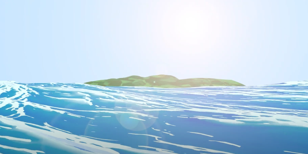
I was interested in creating a cool ocean scene because it is my favourite environment in nature and I wanted to encapsulate it's beauty as best as I possibly could. I saw an animation by the Blender team where they made the ocean look like a painting and I was inspired to create something similar to what I saw in that trailer. I followed a tutorial about how to create an anime ocean as it fit in with the painterly style we were trying to go for with this project. The island in the back was very difficult for me to get right as I couldn’t get the texture to look how I want no matter how many times I tried. The end result isn’t how I wanted it to look like but I think it does the job. This was the first scene I did where I experimented around with the shader nodes to create the painterly texture. I didn’t follow the tutorial exactly and I did some variations to the nodes such as adding extra voronois and different colours to what was advised. I think it looked best when the waves where bigger and a lighter colour however that would not make sense as I was trying to depict the middle of the ocean so I had to turn it down and darken the colours. The hardest part of this scene was figuring out the geometry nodes which I still don’t know much about and was a big learn experience for me and I still don’t understand what I did to make it work but I added stylised foam to the waves so I am happy.
Sky Area


I had created a small sketch of how I wanted this area to look. I had a vision of a soaring skyline with many ruined temples and a character sitting whilst cooking food. Needless to say this scene came out not as planned and many things were scrapped. I started c creation on the base island in the foreground of the scene and made a subdivided cube and sculpted down one point to create a place where the pond is going to go. I Then added an ocean modifier to a plane and slipped it under the land to create a pond. To create the building I just used a giant cuboid and moved it around in places to create a temple looking structure. I created the honey slime quickly for this scene and I think it turned out looking okay but later when it was imported into the scene it looks really bad which I am upset about. The mountains where created by sculpting a plane into a cool shape and I duplicated them around. I saw a cool reference of a tree and tried to copy it but it turned out quite badly and it wasn’t what I was trying to go for but it looks decent enough. The one thing I really like about this scene s the painterly texture on the buildings which turned out ow I wanted it to be but everything else I think looks quite bad and not according to plan. The cooking pot and character where not added because the import was making it lag and the render time was going to be ridiculous. I handed the scene over to Connor after creating all the assets.
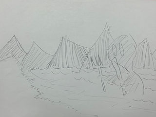
Ledynas

I was very excited whilst creating this scene but in the
ended it ended up not being anywhere close to as
interesting as the initial concept. This scene was the
first time I was fully experimenting with shader nodes
and trying to make a cool unique texture. My original
plan was to have hooded figures standing in the snow
with a big contrast of white and black but this idea
never came into fruition as Sam did not have the
ability or level of motivation to create the hooded
figures. What he ended up making looked not family
friendly and will not be discussed any further.
The scene was actually quite a quick creation and
didn't take ridiculously long to make. I made this
scene when I was bored at night and felt the motivation to create something. My original plan was to make an entire scene and not tell people then show it off however I don't think it looked impressive enough to do that so I gave in and showed them what I had created. I dont know what reaction I expected but they were not overly impressed byt what I had made. I think that the icicles looked very nice and im proud of the texture that I created for them with shader nodes. The downfall of this scene is teh lack of strong shading so It think I really failed there because I didnt knwo hwo to add a shadow to the painterly shader node. My favourite looking part fo this scene is the mountain range as I think the texture is very visually appealing. I really think I failed at creating a sense of scale and its hard too tell hwo big the scene is meant to be portarying. It was meant to be a very large area but you cant really tell so I was dissapointed with myself that I couldn’t find a way too make that.
Sound Design/OST
LS:
I decided I wanted to create the entire sound track of the game or at least a handful of songs. If the game was real I would assume there would be many more songs than this but I wanted to create the songs for all the major locations on the map. I thought this would be a cool idea as it adds to the world building and conceptualisation of the game. I was mainly inspired by games like Minecraft and terraria, with a mix of Zelda too. I wanted the OST to sound electronic and experimental fused with orchestras. The songs didn’t turn out exactly how I want but I think most of them are okayish. The songs will be played over parts for the documentary to add background noise as without music it might be more boring. My favourite song I made for this is the Genoise theme as it sounds like something from the Minecraft soundtrack and is very relaxing but filled with the sentiment of adventure and beauty and wonder of the world. Most of the tracks are just loops for a minute and don’t include any variety but that was simply due to time and I didn’t want to create full on songs just background music. I'm proud of myself that I managed top finish all of these songs and I think some of them are genuinely quite good.
Animation & Compositing
GJ:
Scene 1: Ruins Cooking Pot


Animating this took a long time for me, and I ran into many struggles. The main points I'll talk about are the fire, grease pencil, camera movement, and sound design.
Fire
To do this, I thought I would have to use particles, which I did want to experiment with but ended up doing something simpler and more suitable for our style.
The fire uses a simple icosphere mesh that I slightly stretched out using displacement and sculpting. The fire effect is made with shader nodes; using transparency and then animating the textures on the shape to move. The animating wasn't manual like the rest of them, by using a simple command to enter a script into the nodes. This meant I wouldn't have to spend time individual moving everything around or messing about with particles that I had no idea how to do. If we were doing something more realistic I would've liked to use particles, but this was the best choice for the scene.
This did lead to a small issue in the final render though, which caused the shadow on the blocks to move down slightly at the beginning. Even though it is small, it's quite noticeable. In the future, I really need to look out for small changes and problems to fix them as soon as I possibly could before it is too late.
Grease Pencil Animation
The idea for this scene was to have the bubbles of the soup spell out "Quest Book" which is the name of our studio.
At first a little bit of miscommunication happened where I thought I was meant to animate the oil layer that usually appears on the top of soups which would've been difficult to do since the colours of the grease pencil wouldn't match. However, the vision was to have separate bubbles instead which made this process easier than I had anticipated.
I had done 2d animation before for my first year FMP, so I had a good idea of what to do. I did run into a few issues, mainly with not saving which is a habit that I need to get into. Some of the bubbles would clip into the meat or edges of the pot, which was unfixable so I had to modify the bubble if that happened, some of them stayed like that because there wasn't a way to change it.
Because of how much work went into each frame, I could only make the animation a couple seconds long. The rest of the team were not too happy about this since it had to show off the logo properly, and with the way I did it, it was barely visible unless you were actively looking out for it. Instead of redoing it, we looped it for a bit longer in After Effects.
Camera Movement
The camera movement was the biggest struggle for me in creating this scene. My idea was to have the camera move towards the pot and then bend over and above the pot to then show the bubbling, but this failed completely.
Whenever I would try to do any kind of slightly complicated movements that would include rotating, the camera animation would just break. After a lot of trial and error, we decided to instead do a quick cut from the camera zooming in to the camera being above the pot. Although this wasn't what I had envisioned, it ended up working really well!
Sound Design
For the sounds, we had to come up with a way to make the bubbling sound that would be heard when boiling soup for immersion. At first, we thought to record a boiling kettle, but this ended up sounding like a frying pan instead which was the opposite of what we needed.
Instead, we quickly made a straw out of paper card and used a plastic water bottle to blow into it and create the noise we wanted, this worked much better than our previous idea and sounds quite realistic whilst still having its own stylised touch.

Scene: Yeastard Village


This scene is meant to show the village and its purpose: the living area for many forest spirits that help deliver goods and trade with humans.
This animation has a lot of different small parts to it, mainly what the forest
spirits are doing. Some are floating around, some are talking, and some are
completing their jobs by organising the yeastfruits. Originally, I
made the movements quite different. However, due to my bad habit of not
saving as I work, I ended up losing almost all of the animation that I had done.
This did end up benefiting me though, as I came up with some other ideas of
interaction between spirits, such as the plantasia peeking out from the edge
of the doorframe, or the lilenne winking infront of the screen.
Im really proud of this animation as it reminds me of some Ghibli movies. One
issue was the rendering, this took a while to do. The way that I made the
clouds meant that the rendering time was upped from 10 seconds to 7 minutes
per frame. In the future if I do end up with something like this again, I would
probably render the clouds in the background separately and add that image onto a plane to cut down rendering time significantly.
In some of the movements, eyes or other details on the spirits would behave strangely when moving around, most of them aren't visible. However, I still am not sure what the issue is, so I had to stick to it and hope for the best.

SC:
Scene: Yam Cooking


The Scene I was tasked in making was the scene where a Yam is being cooked on a campfire. To create the scene I was forced into using Blender which is a software I wasn’t very comfortable with as I haven’t used it much. I began by converting all the assets I needed into Blender and begun applying their textures which was very easy as the textures I needed had already been made with all I needed to do was change the colour which best suited the respective asset. Once all textures had been applied it was I decided to create the floor I wanted to add a lot of grass and to do that I had to make the amount of grass very high; I also, decided to use a light purple on the floor as it would match the leaves. Making the campfire was quite tricky as I wanted to have a small circle of rocks surrounding it but I couldn’t find a design I like; originally I create each rock separately and then edited them individually making them all different however, I didn’t like this thankfully I found a way of creating a perfect circle then made gaps to separate each rock which turned out to be the design I went with. I then realised I needed to add a background as at the time you could see straight into the empty space behind my scene, I started off by adding more trees and making the leaves for the trees thicker which some what worked however you could still see some empty bits so I decided to create a hill and added some trees on the hill to make it look natural which ended up working perfectly.
Creating the actual fire was really easy as it had already been made so I only had to import it into my scene and thankfully it was already animated as well; this scene would have taken me longer if I had to animate it as I’d never animated in Blender before so wouldn’t have a clue as to what I was doing. I decided I wanted the campfire to be the only light source as it would look more realistic and create a better looking scene I also, wanted my scene to be set at night as it would make the campfire light stand out more; I didn’t run into any problems whilst making the lights it just required me to change a lot of settings and then reviewing what I had changed. Before I rendered my scene I thought it looked a bit empty so I added one of Logan's characters he had made however, when I added him this caused the scene to constantly lag and therefore made me unable to add anything else; thankfully, I was happy with how the scene was looking. The render only took 3 hours which is probably because there aren’t many polys in the scene and because my scene is only about 3 seconds long, thankfully I didn’t have any problems when rendering.
Overall, I am very happy how this scene turned out considering this was my first time properly using Blender and I have learnt a lot of new skills which could help me in further projects. I am very happy with how the lightning makes the scene look better as it makes the colours stand out more. If I could change something with my scene it would be animating Logan's character; the reason he isn't animated is because when he was imported in it caused Blender to lag and made me unable to do anything else.
CS:
Scene: Sky Scene


This scene was a joint effort between me and Logan, he
done the modelling for the scene while I was the one who
worked on the animation aspects. To anime the honey slime
was very simple by using scale to stretch it up and down,
keyframing it along the way.
I also keyframed the clouds (created by Goda) floating across
the screen to show the audience that this scene was created
in the sky. The animation part of this scene was very simple
to accomplish, but it was the postproduction process that
was the hard part.
I found that keyframing the clouds were tedious because of
how many polys they consisted off, they were very high and
very condensed which resulted in the frame rate of blender
lowering to 4 frames a second. I’m sure there was a way of
making this go smoother but due to it being a simple
animation of them moving to the right I decided to focus my
attention on being able to render it in time. I decided to
make this scene 4.20 seconds because this scene was only
here to show the different parts of the map and not a main
focus for the trailer.
In the postproduction process I noticed that the leaves on
the trees were glitched in some frames which resulted in
them flickering throughout the scene which looked very
strange. I wasn’t completely sure on how to fix this issue so
I asked my teammates and teacher for help, this was a great idea because I found out about the pen tool which crops out certain parts of an image which can be altered how I would like. So, I cropped out how the leaves should look and used a freeze frame to keep the proper leaves on the trees without them flickering.
After fixing the flickering on both the trees I decided to focus my attention to the colours of the scene, I used the brightness and contrast effect to make the colours of the scene more vibrant and clearer then a exposure setting to make the scene slightly brighter.
LS:
Scene: Wizard


I created the wizard sculpt and realised it was pretty much unrigable so I had the idea to just have him standing. I decided to make ferns instead of grass to add variety to the fauna showcased in the trailer. I think that the scene came out decent but I think it looks quite flat and boring which I am not a fan of how it came out. For the terrain I used the landscapes plugin that comes with blender and sculpted the mountains to look more interesting. One thing I am proud of with this scene is the skybox which I accidentally made and it looks really cool in my opinion. I took a random image of an anime style hdri and added a noise node and colour ramp to turn it painterly but the image was so low quality that it turned blocky and look like a palette knife which was perfect for the art style we were going for with this. A challenge was trying to keep the shading on the wizards face looking how I want it to without the sky being grey but I managed to overcome this and and the camera angled more far away so you couldn’t see the bad shading on the wizards face. For the second cut of this scene I changed the lighting around so that the wizards face can be portrayed in better lighting so that it keeps good details. Using shaders for the faces of characters is great but it can cause complications when you want to change the lighting around. I still think this is more time efficient than just using substance painter however because texturing skin with shader nodes takes not very long to make.
Scene: Great Birth

This scene was created last minute with existing assets that were already created complied in as quick of a time as I could. I had a really strong vision for how I wanted this song to look so I tried my best to achieve it. The first thing I did was make a rock base so that the character can be lying in a pool. This scene was heavily inspired by the start of breath of the wild where link wakes up in a pool after sleeping for 100 years. The scene was conceptualised whilst we were writing the story and I decided it was a good idea to use up the main character model and we should sow the start of the game. It would be a waste to not add the main the character to the trailer because I wouldn’t make sense to not show the most important characters all in the trailer. I added the arms of the great birth overseer as is predicted in the story writing lifting up the main character. I imported the character model and began texturing him with the same node setup as the wizard and bat man which turned out quite good. The only variation is a I added a blue refraction to the hair and face as the area is bioluminescent. I imported mushrooms Sam made and added emission to it to make the glow which I think looks quite cool. I added a plane and created very fluffy and dense looking grass which can be interpreted as a sort of fluffy moss or grass. The animation was very basic I just had the characters arms moving up and the characters eyes twitching as they were just born and are confused. The animation as a whole came out decent looking but I think that Is should have made it slightly longer and slowing it down causes complications as the eyes twitching sow looks really weird. For the water texture I used the same node setup as the ball that the antagonist was holding to show the connection.
Scene: Crumble Craters

This scene was something I wanted to create extremely quick because I wanted to show crumble craters in the trailer as it is a large location in the game and it just feels appropriate to show it. I used the ocean modifier and edited it around to make it look like sand dunes and I think what I created is that. I wanted a very unique colour palette so I decided to use a dark blueish colour to be the shading to the sand. I think that this looks very good and the colours compliment each other smoothly. I quickly created a ruin type structure by extruding and sizing around vertices on a cube and I placed them around everywhere. The sand texture was the same node setup as normal for the painterly texture. I used the lunactracity to make everything look more wiggly and detailed whilst trying to stay true to the painterly style that everything else was using. I kept the principled bsdf on the pillars but added a Voronoi and colour ramp to create a haze looking reflection on the light parts of the pillars .I think that everything turned out quite well in this scene especially the fact that I finished it in under 30 minutes. I rendered it with a transparent background so that one could be edited in post as I didn’t want to mess up the lighting I had created.