Artist Research
To gather a deeper understanding on environmental design, I researched some artists and various games. I analysed and investigated their work for effectiveness, influence, workflows, and art direction. This will be useful for my project as I can take the correct measures and follow similar processes for efficiency. I also looked at visual principles to further understand how they affect environment design and how the story behind it is percieved.
Skyrim
Bethesda Game Studios. (2011). The Elder Scrolls V: Skyrim.
The Fifth instalment of "The Elder Scrolls" series.
The first thing I decided to research was a game I've heard of many times, but haven't played. It's one of the most popular games of the 2010's and has won several awards including "Game of the Year", so I thought it would be useful to explore the design and workflow used to create the game.
Joel Burgess (A Senior Designer at Bethesda) frequently mentions "art fatigue" in his description about the process of level designing in Skyrim. Art Fatigue is the idea that when using modular design, players are likely to notice repeated art/models throughout the game which slowly ruins the authenticity of the in-game world. However, players are more likely to notice repeated clutter before they notice repeated architecture. To fight this, instead of using warehouse cells (pre-set rooms) like they did in the previous instalment, the level design team switched to mixing different kits for more variation to reduce the previously criticised repetition as much as possible whilst still keeping an efficient workflow. This is a good example of taking your audience into consideration and changing your work to appeal to them, whilst also making sure the team works in the best way possible.
This is more difficult to work on than it would be using warehouse cells, the communication between level design and kit artists is very important, because of the way that Bethesda works, the two separate teams are only really required to communicate when exchanging their work. As the artists are responsible for making the levels they're given to look as visually appealing as possible, without the correct communication issues can occur. For example, "A wall intended as a visual blocker is now a see-through chain-link fence", which doesn't serve the purpose intended by the level designer.
Process of Kit Creation:
When creating kits, functionality is much more important than aesthetics in the beginning stages so that work can be done efficiently, instead of the other team having to wait. Adjustments to the art are made in the finishing stages to tie it all together.
Concept Phase: Both level design and kit artists work together at the beginning to ask themselves questions such as: How will this kit be used? How will it differ from the others? What is the theme? How often will it be used? This helps the team gather information which they can then apply to their research and when gathering references, making sure they are on the same track. They begin to create concepts which they will then begin to explore in the next phase.
Proof Phase: This phase is for testing out and bringing to life the major concepts created. This is fairly short; although they start building assets, they have no textures at all, in this stage art is not important yet. They also start to play around with proportions, positioning and other basic needs. All the work done here saves time for the art team so they are not wasting hours. It's also when bugs or glitches that might appear can be fixed before it becomes more complicated to in further phases.
Grey-box Phase: The goal for this is to try out and figure out what the most common pieces of a kit will be. This phase is also when the level designer can start testing with real layouts. The focus is on how the kit works, not how it looks. The artist and designer work on abbreviating the names of the models, this is tedious but very important so the coding team can work as efficiently as possible. These should be easy to understand. They also start changing pivots now , as later it can cause issues and errors.
Build-out Phase: With the main pieces proven to be functional, the art team begins developing the pieces visually; less important pieces can be added now too. It is important to focus on basic pieces before more unique ones as the basic ones are used much more frequently.
Polish Phase: Responding to bugs, usage cases and adding functionality are the key points to this phase, as well as polishing up art as needing now that the most important things are done and out of the way. Both parties need to talk critically as requests come up to manage their work loads. Always look for previously used alternatives before creating new ones to save time.
-(1).jpg)
Fallowstone Cave (The Elder Scrolls V: Skyrim)
Chase Richardson. (2022). Skyrim: 10 Most Fascinating Locations In Game. [Online]. DualSHOCKERS. Last Updated: 23 October 2022. Available at: https://www.dualshockers.com/skyrim-weird-locations/ [Accessed 1 October 2024].
The colour scheme throughout the game is very neutral and gloomy: lots of greys, browns, and greens are used throughout. I think this matches the inspiration behind the towns and landscape, being Nordic countries. I also think their designs are good in how they look easy to navigate, which makes exploration more fun for the players, and is just more visually appealing overall. Each town, village, and region all seem to have different inspirations behind them, but they all clearly tie into the same broad idea.
After doing research, I will definitely take inspiration from their workflow as it is well structured and will help with my struggles of time management. I also want to take inspiration from real countries and cultures like they have, and incorporate them into my project.
OMORI
Omocat. (2020). OMORI.
Indie psychological horror RPG
The way this video game portrays the protagonist's trauma and the way he deals with it is extremely interesting to me, whether this be through music, NPCs, or environment design. As my project is focused on creating an environment, I will explore the visuals in depth. The game creates a looming sense of tragedy as you play, but the source is unknown for the majority of it. To reflect how people deal with traumatic events in their lives, OMORI separates this into 3 distinct areas, each with their own aesthetics.


White Space - Avoidance
The very first area you visit in the game is White Space: an empty, pure white space where
the protagonist resides. The branch coral describes it as "An emptiness, a home without
warmth. A place to survive, but not to live." This area is extremely minimalistic, orderly, and
objects are spaced fairly apart from one another making it appear more empty. It is a
risk-free way of escapism, a predictable space, the perfect place to feel safe. The colour
scheme is basic, it is just black and white as to not evoke any emotion. The fact that not
even shades of grey or even shading are used makes the player feel bored when exploring,
but it is also an area of solitude. This place does a great job at reflecting the feelings of
Omori and how he perceives White Space into the environmental design, this immerses the
player as a start to making them feel the emotions he is feeling.
To further imbed the idea that this is the protagonists safe space, any time that you get closer to discovering the truth behind Omori's trauma, the player is teleported here. They are being protected from the exact thing that caused Headspace and it's respective regions to form. However, as you progress it is not as comforting as it is in the beginning. Headspace is highly engaging, interactive and bright, which contrasts the orderly and plain White Space, dramatizing how empty is really is, therefore making the area more significant. It makes the player slowly begin to think of this place as an uncomfortable area. Every time you are teleported back to White Space, the music changes slightly. The second track differs from the first, being the 8-bit track, by the piano being more hesitant when played which reflects feelings of anxiety and stress.

White Space (OMORI)
OMORI Wiki. (2020). WHITE SPACE. [Online]. Fandom Wiki. Available at: https://omori.fandom.com/wiki/WHITE_SPACE [Accessed 3 October 2024].


Headspace - Regression and Nostalgia
Headspace is the largest area in the game and encompasses several areas that you explore
during your adventure. Based on Omori's life before trauma, this world is reminiscent of
children's playrooms. Saturated yellows, pinks, and greens are used throughout this area to
bring the player a sense of nostalgia (paired with the 8-bit music in some areas) and childlike
curiosity. High saturation is also known to evoke strong emotions: "Warm colour palettes
typically feel inviting and soft, while cold palettes feel more clinical and raw."(Noam Kroll). It is
made to be a comforting area, just like it is intended for Omori. This area was made to distract
and escape his trauma, so the gameplay does exactly that. Because everything is highly
stimulating, along with how much content and exploration there is to do, we are lead to then
forget the main objective of the game, and are put into the protagonist's shoes. You are also
escaping his trauma, being distracted by everything around you. It is the complete opposite to
the blandness of White Space, yet it has the same objective.
As you play, disturbing entities appear out of nowhere, catching the player off guard. These
entities, called "Something", are pure black, which contrasts the bright scenery of Headspace. After a while, you realise the true objective of the game is piecing together Omori's fragmented identity, facing your trauma, and truly accepting it rather than hiding away. The way that the map is laid out is quite clever too, the lower down you go, the closer you are to the truth, and the more secrets you discover. One area in particular being Deeper Well:
Deeper Well
An underwater area, an area of no return. You have reached one of the deepest parts of
Headspace, and my personal favourite. The environment design here reflects how deeply
buried his trauma is with the underwater theme.
Headspace is starting to lose it's structure of being a bright, nostalgic place; instead switching
to an alien-like area. The colours used here are still bright, but they are over-saturated, as if
the area is desperately trying to mimic the rest of the world. However, these colours bring
overly intense and strong emotions in place of the comforting colouring in the areas over
ground. Navigation gets more difficult here too with water filled holes being used to teleport
between islands, but this is done on purpose. Usually difficult navigation in video games can
get frustrating quite fast, but the way it is done here is clever. Omori is trying to get you as far
away from the truth as he possibly can. The music here is mysterious too to match the scenery.
The entities here take strange forms that are not really seen before, making it even more
unsettling. Things shift quite quickly in one area, where the entity "Branch Coral" resides. If a
certain action is done, the whole area changes into red which gives the feeling of danger, but
quickly returns to the alien-like colour scheme straight after, which confuses the player even
further than before. After discovering the truth behind Omori's trauma, the player is lead to Black Space.

Forest Playground (OMORI)
OMORI Wiki. (2020). FOREST PLAYGROUND. [Online]. Fandom Wiki. Available at: https://omori.fandom.com/wiki/FOREST_PLAYGROUND [Accessed 3 October 2024].

Deeper Well (OMORI)
OMORI Wiki. (2020). DEEPER WELL. [Online]. Fandom Wiki. Available at: https://omori.fandom.com/wiki/DEEPER_WELL [Accessed 3 October 2024].


Black Space - Facing Trauma
The last area of the game, where Omori faces his trauma head on. This area has an eerie and
uncomfortable atmosphere, it looks like an inverted version of White Space. Only now, many of
the items you are used to being there are gone. This causes the player to feel uncomfortable,
it is familiar, but at the same time it isn't. It is still minimalistic like before with the extreme lack
of detail, but this is thrown off with the disorganisation of the doors. It mirrors the
experience of trauma recovery, how confusing it is, and how there is no clear direction to go
about it.
Each door has it's own corresponding area, with their own colour palettes and music. They are
completely unrelated to each other, only in the sense that they represent Omori's trauma in
some way. Because this area is so unpredictable, it gives a feeling of extreme danger and
disorientation to the player. Unlike the previous areas in the game, this one is raw and
unfiltered. There is a severe lack of unity, which is done deliberately to cause anxiety. The
sub-areas for Black Space each have different textures and looks to them. Some look hand drawn with crayons and pencil, some are very abstract with clear, straight lines, and others are in the original pixel style. Areas and entities from Headspace are reused in some sub-areas, you are given a sense of familiarity again, only to be destroyed by glitches in the music and/or the environment, which makes it even more unsettling. If a different route in the game is taken where the protagonist chooses not to recover from his struggles, an additional area called Black Space 2 is unlocked. This area is similar to the original, but is even more disorganised. Instead of straightforward doors leading to their respective areas, Black Space 2 provides you with 5 main doors (the others being inaccessible) which each have sub-areas, except this time you have to find them yourself by exploring. This is interesting, because instead of having a slightly more clear direction like the recovering Omori does, the hikkikomori version is even more hidden.
This kind of environment design is extremely interesting to me, it gives the player something to look out for in every area to gain clues and information. I want to do something like this, creating a small story and placing things in the environment that relate to the story. I'll also try to use colours to reflect the emotions I want to evoke in my audience, and make sure to use visual principles to create the best work possible.

Black Space(OMORI)
OMORI Wiki. (2020). BLACK SPACE. [Online]. Fandom Wiki. Available at: https://omori.fandom.com/wiki/BLACK_SPACE [Accessed 3 October 2024].
Genshin Impact
Hoyoverse. (2020). Genshin Impact.
Open-world Adventure RPG
The artists and level designers of Genshin Impact draw inspiration from various cultures and adapt these to the in-game world, Teyvat. Since every region in the game is based off of certain cultures, the research they do is very in-depth, it is important that the team is respectful and manages to adapt it in a sensible way. Though this isn’t always done, when it is it rewards players with a feeling that their cultures are being represented in a media they enjoy, making them want to play more.
All aspects of the environment will link back to something, or someone. Every mountain, ruin and small detail will somehow always intertwine with the storyline. This is important because the environment is not just for visual aesthetics, but is significant to the narrative and also enhances player immersion. Through researching ancient architecture, regional climates and traditional designs, the game takes a lot of inspiration from real life countries, regions and geographical structures to add in for more authenticity.
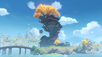
The main region I will be looking at is Liyue, specifically Wangshu Inn and its surrounding geography. The inn is a structure built around a pillar of rock that looks over its area (Bishui Plain), as a centre for travelling merchants to set up stalls and to look at peaceful scenery, though it is just a cover by undercover agents from the countries government for assisting a character in his excursions. The reference for this idea was from the martial arts movie, “Dragon Inn” which was peaceful and calm on the outside to bystanders, but is actually a cover for a clash between tigers and dragons. In the story it is also said that the area experiences frequent flooding, which further explains the structure. Yet at the same time, it should also look striking to the eye for aesthetic purposes. It was mainly inspired by Fenghuang Ancient City Stilted Architecture and Xuankong Temple in the Shanxi Province.
When thinking about the design, the team asked themselves questions like: How do
people get around? What do people do here on a day-to-day basis? This helps them
understand the behaviours of in-game characters, so they can apply it to the design and
make it as authentic as possible. At the bottom floor, tables and chairs were placed for
resting travellers, to make movement around the inn more lifelike, they placed a water
powered elevator for transportation of goods and people trying to get to the higher floors
with ease. This approach was also taken with the interior, taking the NPC’s needs, wants,
and everyday behaviours and applying them into the design. Several rooms were created
including a kitchen, reception area, and a large balcony for visitors to look at the entire
relaxing landscape all in one place.
Though the colours are natural and should blend into the background, by using browns,
greens and yellows, they stand out because of the way it is built. The height of it helps
emphasise the building, with slight uses of red that help it stand out a bit more. Most of
the building uses straight lines, the tree around it contrasts this by curved lines around it,
with the yellow leaves of the tree contrasting against the blue sky to make it more seen.
I think this design is clever, using real life structures and stories to inspire their buildings
and terrain whilst also giving a feeling of fantasy and excitement through their use of visual
principles and elements in the design. I want to take inspiration from this by using real life
terrain to inspire my environment, and including parts of the story into the design.


Mondstadt: Gothic architecture, windmills, vineyards and tavern take influence from medieval European towns, mainly countries like Germany.
Liyue: takes inspiration from Chinese culture and architecture, the traditional aspects are deeply integrated into this region.
Inazuma: inspired by Japanese culture, with many shrines, cherry blossoms, and building design.

Fenghuang Ancient City Stilted Architecture
Ziyuan. (2020). Developer Insight Second Issue - Liyue Chapter 1. [Online]. Hoyoverse. Last Updated: 2 May 2020. Available at: https://genshin.hoyoverse.com/en/news/detail/103681 [Accessed 3 October 2024].
Lisa Grice. (2021). Genshin Impact 2.0: Everything Revealed About Inazuma So Far. [Online]. ScreenRant. Last Updated: 10 July 2021. Available at: https://screenrant.com/genshin-impact-2-0-inazuma-region-details-story/ [Accessed 3 October 2024].
AMajesticPoro. (2021). I love that Liyue looks so beautiful and scenic during this event!. [Online]. Reddit. Available at: https://www.reddit.com/r/Genshin_Impact/comments/sfwhwm/i_love_that_liyue_looks_so_beautiful_and_sce [Accessed 3 October 2024].
Jessica Clark Dillon. (2020). Genshin Impact: 10 Tips For Completing Mondstadt: The City Of Wind And Song. [Online]. The Gamer. Last Updated: 25 December 2020. Available at: https://www.thegamer.com/genshin-impact-tips-complete-mondstadt-city-wind-song/ [Accessed 3 October 2024].